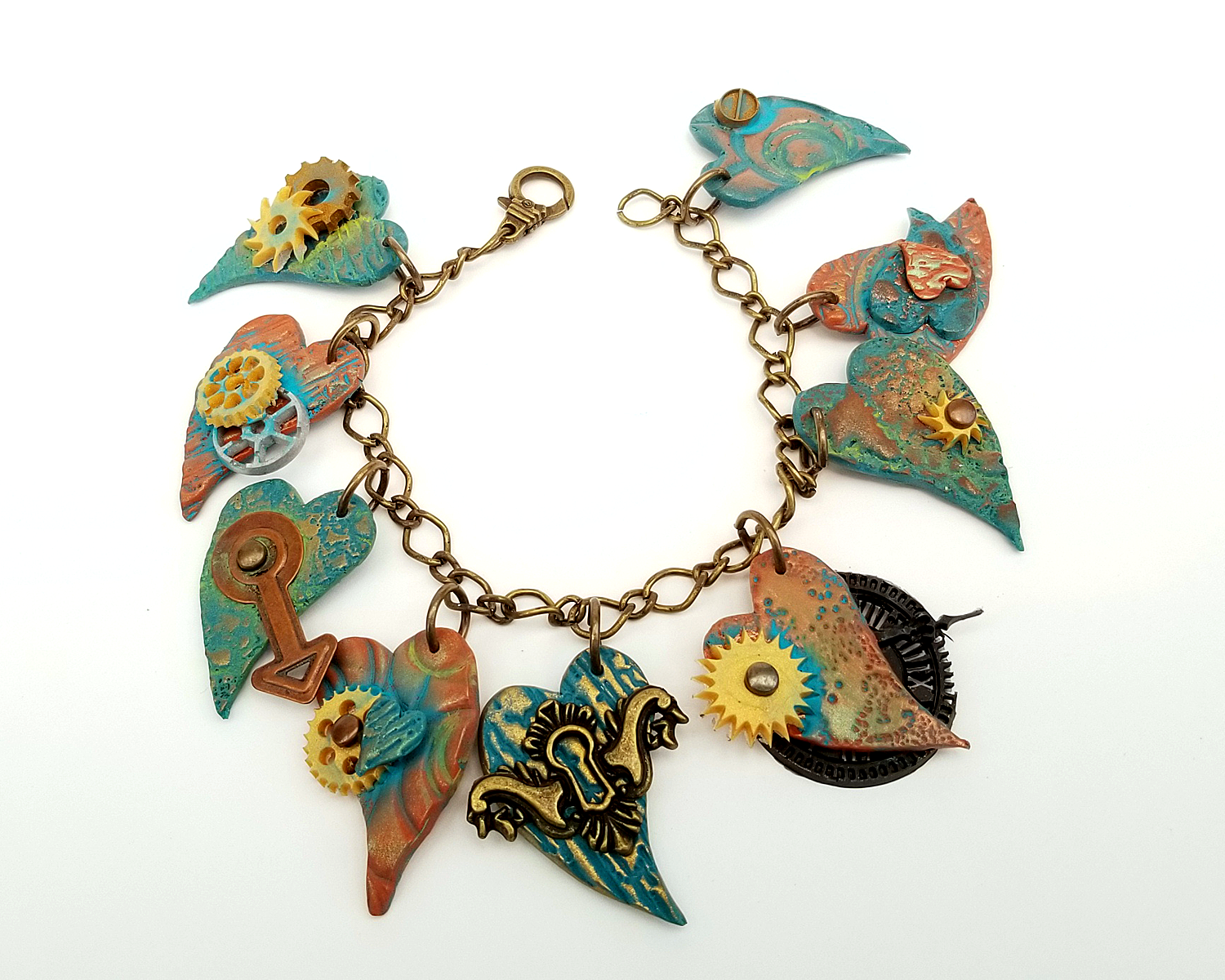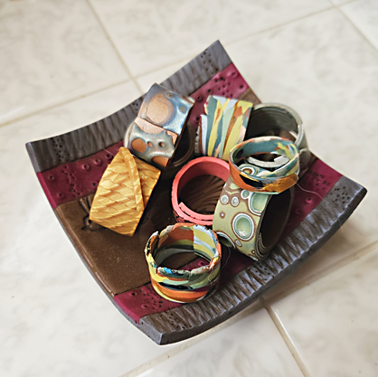
(THANKS to my guild-mate Kathy Hepburn for the gorgeous polymer clay bowl!)
I think I have more fun playing with scrap than I do with a fresh bar of clay! One of my most favorite things to do is to make myself fun little rings with the scrap. I’ve made several over the years and I haven’t had one break yet-and I am guilty of gardening in them. I’ve used both Sculpey Premo and Sculpey Souffle (my fav!)…or a combination of BOTH since it IS scrap..
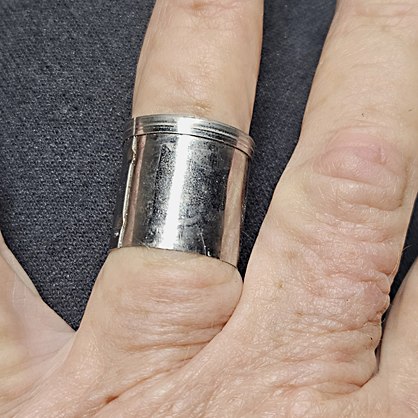
You can CAREFULLY try one of your round cutters on your finger – NOTE that it doesn’t fit all the way on my finger? That’s good, because the clay wrapped around the outside of the cutter will be slightly larger. This is a .75 inch round Sculpey cutter and it is just slightly smaller than my Size 8 on my ring sizer. You can also use a .75 diameter wood dowel as well (which I often do depending on the amount of my scrap) – again, depending on your ring size.
Roll your clay out on a fairly thing layer – I usually use a 4 or 5 on my machine (0-9 with 0 being the widest). My thinner rings seem to be quite sturdy.
So now all you need to do is cut a strip of your selected clay a little longer than the round mold you are using and trim the width to whatever width you wish. I’ve been going thinner and thinner on some of mine (I’ve got short fingers).
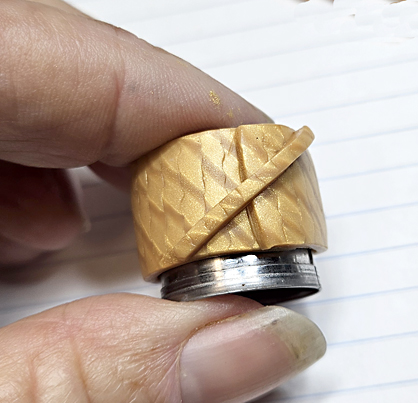
Wrap the clay lightly around your mold, allowing for a slight overlap. Remove the clay strip and trim the overlap shape if you wish – I often use a long triangle shape, but I’ve thought about using a scalloped shape as well (as soon as I find THAT cutter..). For this ring, I also added a small strip across the top for interest and I really liked the way it came out.
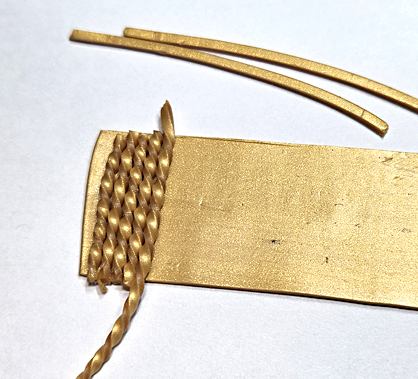
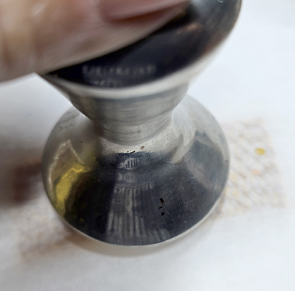
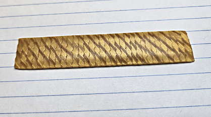
FYI- This is Premo 18k Gold and I just used mica shift to create the pattern. Twisted strips laid on a very thin backsheet then smashed flat, trimmed and the edges rounded (with the same coffee tamper I smashed it with). YES, I cut on lined index cards or graphed index cards!
You can see on many of the other scrap rings that I even left an uneven edge either at the overlap or along one edge of the ring. I’ve also used scrap from transfers and silkscreened clay as well.
xoxo, syn