Layer Sets with Liquid Clays

Did you know that if you add a thin layer of Liquid Sculpey to a sheet of raw clay and let it set a day or two that the LS will absorb into the sheeted clay and be dry on the surface? And the sheeted clay will be super supple!  Its really fun if you use the metallics or Primary colors to add a new dimension to your work.  You can even create patterns in the LS before you allow it to set up.


Once the LS is dry to the surface, you can run it back through the pasta machine (if you want to), you can silkscreen on it, transfer to it, add pastels and mica powders, stamp it, everything you would do to a normal sheet of clay. I particularly  like  to  add  the  metallic  LS  colors  to  my  sheets.


Of course I love to add my transfers over the top of the set layers!

ALSO, if you have a sheet of kind of dry clay, you can add a SMALL amount of Clear LS with your finger to the sheet, fold it with the LS to the inside of the fold and continue through the pasta machine.  The clay will become much more workable in 2 or 3 more passes through the machine!  This is a “wet” technique.  Why not try it with a metallic or primary color as well for a totally different look?  Just remember a little goes a long way and you don’t want to make a mess on your pasta machine with too much!

So here are some silkscreens and transfers.  The colorful hearts are the Primary colors dropped onto the Premo Accents White Gold Glitter.  Then I rubbed the surface with a sheet of deli paper to smear them slightly before I let them set up for a couple of days.

Of course all of these have a layer of Clear LS on the surface.  I cured them with a PRE HEATED dual speed heat gun.  I also add a little Sculpey Clay Softener to the well mixed LS to help apply a thin layer.


So what happens when I grab a piece of scrap that I twisted and rolled into stripes and add a Layer Set of Gold LS to it?  Well, of course I had to transfer my beloved Scribble artwork to it.  It just so happened that this bracelet blank had rolled off the pile o’ stuff behind me and settled under my work table a couple of days ago.  Once I got the sheet done, I was like, “hmmm, bracelet?”  I remembered that this bracelet blank was “filed” under my table, so I grabbed it and voila!  I love the sparkle of the gold through the colors.  And of course, I love my two Souffle bracelets I always wear (even in the pool 3x a week).  I have to argue with people that they are NOT leather… lol


Posted in Clay | Tagged , , | 1 Comment

First Thoughts on Citadel Contrast

UPDATE 7/21/19

I know I just wrote this, but I forgot to mention that apparently the Contrast Colours “don’t play well with water” – even though you clean up with water.  They make a Contrast Medium that you can add to dilute the intensity of the colors.  I tried a little as a top coat and I *think* it made the clay a little sticky.  It may be like their other matte medium works on clay, but their gloss (Ardcoat) stays sticky..  More tests!  Where is Ginger????

Sooo, I was SUPPOSED to do the work for this blog post yesterday, but right in the middle of my testing setups, I got the call from my Locals to go eat street tacos and drink beers.  Yah, so THAT won…I did manage to take one photo before I left and I finished the rest of my experiments this morning.

First lesson – WEAR GLOVES!  I did this yesterday without gloves and I had lovely brown, yellow and dark blue finger tips (including my large bandage on my thumb – hedgetrimmer got me).

These are the colors that I used for my test pieces. The names are pronounceable, but still rather colorful.  Left to right: Snakebite Leather, Terradon Turquoise, Hazdreg Yellow, Basilicanom Grey


The Contrast Colours are designed to be painted onto the base coated plastic or metal tabletop model and allow the colors to flow to create shading. My son, my painting expert, tells me that they are heavy pigment glaze.  Yes, it WILL find every crack and crevice, but I found that by painting it onto the textured surface, letting it set a moment (dependent on ambient temp/humidity in your workplace), then wiping the top surface with my GLOVED finger really helps.  Note that I have a baby wipe in my hand to wipe the glove on.


First rounds were with the Snakebite Leather on Premo Accents Grey Granite, Souffle White and Premo Accents Gold


Next was the Hazdreg Yellow on Premo Accents Grey Granite, Souffle White and Premo Accents Gold


My current Favorite: Terradon Turquoise


I only did a couple with the Basilicanom Grey because it’s so BASIC


Then I did some pieces with Pan Pastel, Pearl Ex and Gold Lumiere with the Snakebite Leather because I had noted on another piece that the Contrast had “grabbed” the powders.  Top left – Just Premo Accents Copper, Top right: Spring Green Pearl Ex, Bottom Left: Gold Lumiere and bottom right: Dark Green Pan Pastel.  The Contrast did lift some of the Pan Pastel when I rubbed it with my glove, but in a SUPER COOL way (look at the large leaf). The texture here is from the new Sculpey Nature texture sheets.


Okay, here are the pieces I did yesterday with the Souffle Mandarin and  Basilicanom Grey (texture is from one of the new Sculpey Geometric Texture sheets._

  And for those of you who want to know what my “studio setup” is for my photographs.  It is a white poster board on my work chair and I pull my work light over.  It’s all about EXPOSURE.  I adjust my exposure on my CAMERA PHONE to compensate for the white background.

Posted in Clay | Tagged , , , | 1 Comment

synsseaweed!

seaweed-30Hey you guys!  I made a little video of how I make the kelp (seaweed).
 

Posted in Clay, Uncategorized | Leave a comment

I’m All About My Hats

If  ya see  me,  I usually  have  a hat  on.  Not  only  do  they  help  protect  my  redhead  skin,  but  they  often  let  me  show  off  a little  bit  of  clay!

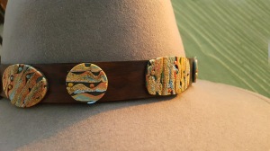
My hat bands are often decorated with those extra clay bits that are too good to toss, but redundant for my jewelry.

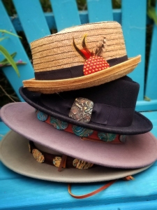
I’ve been thinking that I needed to catalog all these hats and, since June Gloom is upon us, I had a perfect soft light day to photograph them!

So here is syn’s hat stash.. many have project links (mostly to Sculpey)

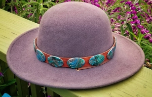
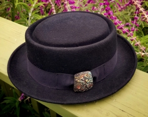
My first two bands on my favorite Brixton wool hats (they seriously feel like wearing your favorite robe). The top grey band is strap leather, dyed with Pinata inks. The clay is leftover clay from a NCT mix and created with what I call Meisha Mash.


The blue grey Brixton has what I call Watercolor Waves


I use small velcro dots to hold my bands to the hat!


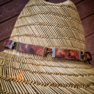
My sunhat has some of my ribbon crimp clay pieces created in a Claire Maunsell style. This is Igloo Souffle.


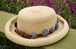
I like to shop the accessory areas for small belts on sale. Then I just cut it to size and poke a hole for the buckle!  These are my version of mokume gane created in Souffle Bluestone, Poppy Seed and Igloo.


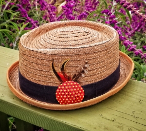
A straw hat I got in a hat store on the Olympic Peninsula.  The band and feathers were perfect for one of my SynsPins extra pendants. OF course this is Souffle and Etch n’ Pearls!


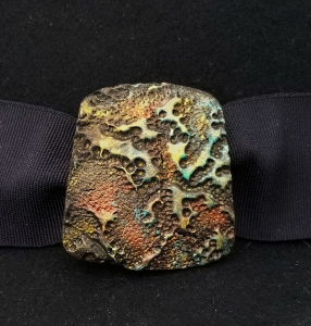
Another felt hat with an extra pendant piece glued over the hatband.


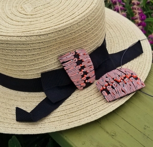
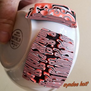
My latest band.  I had two pendants finished, so one is now attached to my new hat covering the bow knot. When I shape the pendants on a small bowl, the curve is perfect to cover the bow on my hats!


Posted in Clay | Tagged , , , , , | Leave a comment

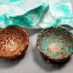
Play Day – Coiled Bowls

I posted this Instagram photo yesterday from my Clay Play Day (getting happily dirty in my garage) and my friend, Brandon Leggitt, asked me for a tutorial on it. So here you go Brandon!

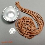
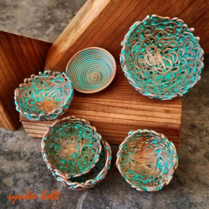
First, I’m using Bath Bomb Molds 


Then I extruded Premo Accents Copper clay (my clay crush in Dec/Jan – now it’s Souffle Cinnamon).  How do I extrude my clay? I use the Makins Green extruder, Cynthia Tinapples adaptor, a mini cordless drill (USB powered! $25 at Home Depot. TSA/USPS approved. I pack the extruder and dies in the original box with the drill and check it in my tool bag).  This drill is more powerful than my big drill and holds charge FOREVER..

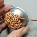
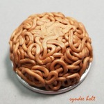
So once I have the extruded clay, I just kind of do the Hostess Cupcake squiggle all over the bowl. YES, there are small holes, no I don’t think about perfection. (DUH!) Just tuck clay ends into the loops as you work.

Once I have the bowl covered to my satisfaction, I press it lightly onto my worksurface to slightly flatten the bottom and bake it.

When it has cooled (yeah no, I don’t wait.  I let it get KINDA cooled), gently peel it off the bowl.

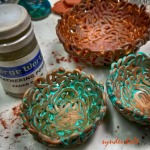
Select your paint color – I use the cheapest acrylic craft paint I can find.  Many of you will recognize this as my go-to CraftSmart Ocean Breeze. I don’t use Gloss, I try to find Matte. Then wash the entire inside surface, using a smallish brush to get into the nooks and crannies.

Quickly wipe the paint off with a baby wipe.  Find the cleanest areas on the wipe and wipe it a LOT. Repeat on the outside. IF you are like me – put it back into the preheated oven for about 10 minutes to dry the paint.  Otherwise, sit back and wait….

UNLESS..

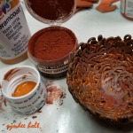
You happen to have Weathering Powders.  I dry brushed some Green weathering powder onto the damp paint in the bottom of the bowl on the left.  That larger bowl in the back?


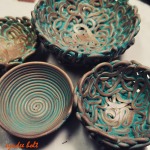
Graphite clay, terra cotta colored paint and rust weathering powder. Sanded slightly after backing to bring out more of the graphite.

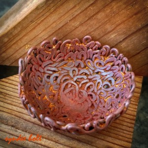
Now the Hero Shots..


NO! I’m not sealing these….

No Brandon, can I go back and play??

xoxo, syn

Posted in Clay, model painting, Photography | Tagged , , | Leave a comment

There’s ALWAYS Options

I had an assignment the other day for a specific design.  I was pretty excited because I had been thinking about doing some work with this type design.  My brain was firing instantly – “2 colors? just circles? circles and balls?” and on and on.  Then I saw the phrase, “please no options.” Ohhh, this person knows me well!

I tend to work in trilogies.  If I like something, I need to have 3 of them.  Like this shirt? But it in 3 colors.  Like this design? Do it in 3 ways.  This little voice in my head (probably coming from my right hand that ALWAYS has the most harebrained ideas) said, “ohhhh, theres ALWAYS options..”

I completed the assignment and sent it off and came home of the Fed Ex store right to the clay table.  For three solid days (3 again?)  I was working.  As soon as one was almost complete, two others were in my head.

First day, I started with a Creative Map

I started with circles and began my rule set – only Sculpey circle cutters, only Souffle.  That

The cover shot I took for Polymer Cafe of my cutter bracelets

black straw I got by drinking a blood orange margarita (oh, the sacrifices we artists make!).  It was the perfect diameter to use for the center holes.

I thought I would stop after the circles, but then I remembered my cutter bracelets and the game was on.  ANY Sculpey cutter was now in play!

I stopped at seven different designs, but I’ve got at least 2 more in my head- 3 sets of 3 – perfect!

I think it’s good to do this type of work.   No fancy patterns, no fancy surface treatments – just shape and design.  It’s both exciting and relaxing at the same time. It’s like creating your very own jigsaw puzzles – except of course, these you can wear when you get them put together!

Posted in Clay, creative maps | Tagged , , , , , | Leave a comment

A New Creative Map!

Map #5 was “drawn” yesterday..

I made these blue pieces in an excellent Jana Roberts Benson class at Fandango last May and promptly lost them in the chaos of my worktable.  I was forced to clean the table so I could work in something larger than 4 square inches of dirty tile and I found them – about 5 inches from the work surface.  It WAS that MESSY..

Anyway, I had made what I call a “left turn” in the class and started playing on my own with the “what ifs”.  I was so intrigued with the little pieces I cured them, brought them home for further study and lost them in the table chaos.

So, yesterday I sat down to play with the possibilities I saw in them.  First, I moved to my favorite green color palette and my favorite Melanie Muir template shape.


They didn’t really get me excited, so I decided to change up the color palette to reds, which is not a normal palette for me. I changed my shapes as well.  I like the heart shape here and I like the gold dots I added after curing.


I had a piece of scrap left and randomly started folding it until I saw a rough heart shape and completed the shape.  Of course, I can’t recreate it, but I really like it!


When I started to clean up, I found this pile of thin pieces I had off to make some slices smaller so I added them to a backing sheet and used the heart cutter that was handy. I was so intrigued by these colors and textures that I sliced up the remaining portions of the sheets and used my favorite shape again. After curing, I even added more texture by randomly adding gloss glaze to some of the threads. I really kind of like these!


So here is the whole map:


Posted in Clay, creative maps, Photography, polymer clay retreat | Tagged , , , , , | Leave a comment

Oh boy! More Toys!

By now you all know that my very favorite stamp is the 2207J

Well, Linda Prais from LindasArtSpot.com found it’s siblings!  You all know Linda – she is the one who made 7 of my transfers into silkscreens.

I grabbed these stamps from her and I’m already in love with the first two I’ve used!

The Esponge 2428J (sibling from another mother, since it isn’t a 22xx series..)  is a stamp I’ve had before and loved (gotta clean those stamp drawers) since it’s non-directional and has both deep and light textures to it.

The Birch Forest 2277J does appear to be directional, but when I stamped it on some marbleized scrap from my August NCT, that pattern took on a funky 60s sort of vibe to me (that I adored of course!)

Both stamps are as large as the 2207J, which works just fine for both small jewelry and larger items like journal covers.


As you can see, the textures are deep and nicely defined.  And they seem to play nicely with each other, when I combined both textures for these pendants below. I added Aztec Gold and Copper highlights to the 2277J stamped clay and Citadel Coelia Greenshade to the 2428J Gold clay.

I can’t wait to try the other two siblings she has posted on her website as well, but I know these two are going into regular use with my beloved 2207J.

xoxo, syn

Posted in Uncategorized | Leave a comment

The Mother of Invention: A New Creative Map

Sometimes I  sit down at my clay table with a specific goal in mind, but no idea really how I’m going to do it.  Then I document each and every step of the design process to create what I call my Creative Maps – or how I get from here to there..

This time I wanted to see if I could adapt Mr. Jan Montarse’s Easy Back so it could be used not just for pendants, but for broaches as well.  I had thought of and rejected at least 15 different ideas, but once I had a piece in hand, it was so obvious to me!

mapASo this Creative map is in 3 parts. First, the actual adaptation (the JanSyn back?) click the picture to make it bigger!   I was consolidating some transfer art folders into one folder on my cloud and I came across some images I hadn’t played with yet.  Perfect for my trials right?  I also wanted to play with my new Melanie Muir template I got at ES2.


This idea worked!  the shape of the circle helps to lock the pin back into place. So now this piece can be worn either as a pendant (through the top holes) or a pin (using either one of the top holes and one of the smaller holes).  My early prototypes (you will see later) only had one smaller hole, but since I couldn’t be bothered with deciding which way the pin would sit from the back, I put 2 holes.

MapB

I found this old image of grasses and thought it would be perfect for another idea I had percolating.  I had decided that my Sculpey New Color Tuesdays for August would be about the blues.  I don’t normally use blue clays, so it was time..

Now since I knew from my coloring that the blue/teal pens shift to lovely greens on gold clays, I decided to add a little bit of gold to this Skinner blend of Souffle Sea Glass and Robin Egg by adding a very thin layer of Premo! 18K Gold over the entire blend before starting it.  This didn’t have to be a perfect Judith Skinner blend of the colors, so I just overlapped the two colors. It worked!  My blues shifted to rich, warm teals!  And you can see that this original prototype (with only one broach hole at the bottom) is sporting both the pendant cording and the pin- I may even wear the pendant with the pin in place since we don’t have much call for wearing clothing heavy enough to support a broach.  The pendant pieces were baked on a large metal bowl to give just a gentle curve to them, while the back is baked on the smallest mound on the Sculpey Hollow Bead Maker that it will fit.

MapC

But I wasn’t done!  I did my NCT August Blues mixes and used the scraps from that as just marbled clay to create some more pendants.  I even added some more oldie-but-goodie transfer patterns to the mix, this time experimenting with mixing the patterns and colors.

And finally, I had a bolo tie mount that I had been thinking about, so I started the prototype for it as well.

A totally fun day!

Click here for the PDF of all 3 maps: Map binder

Click here for the PDF of the grass transfer: SP 45-2 combo

Posted in Clay, New Color Tuesday | Tagged , , , , , , , , , | Leave a comment

The Advantages of a Disadvantage

synsgraphicsSo most of you know that I’m currently sporting a non-walking cast and using a knee scooter (2).  Looking at the advantages of being a little less moveable, I have been wanting to create some more transfer patterns of my own (vs purchased clipart) for awhile, so I spent an afternoon creating several patterns. These graphic designs were created in Photoshop, while the floral design below was hand drawn, scanned into Photoshop, cleaned up and some small dots added to the artwork.

Then I spent a couple of days trying to get the nerve up to ask one of my neighbors to drive me to Kinkos so I could print them on their toner-based copier so I could transfer them. I thoroughly enjoyed basking in their glow on my living room table for an hour while I cut them apart.

My current knee scooter is designed for outdoors and is too large to navigate the narrow (hoarder style) paths in my studio, but I do have a smaller, lighter scooter (designed for little old ladies) that I found that I could pretty much navigate in the studio.  So between the rolling office chair and the scooter, I spent a productive day in the studio yesterday! I finished 15 pendants and earring sets, using the new patterns and my favorite stamp.

stamp and gellismFirst the favorite stamp part. This is a marriage of my stamp and a gelli plate on Sculpey Souffle. If you don’t know about my stamp: https://synssculpeyblog.wordpress.com/2016/03/11/2207j-my-most-favorite-stamp-ever/

Now some of the pendants with the new designs (left one is much nicer than this photo) (Premo! Accents Metallics and Glitter Metallics):

synsart2


And finally, one of my new floral artwork designs (much prettier than the photo):

And yes, Fandangoers and Euro Synergy 2 class people, these patterns will be used in class.  There will be tutorials coming out on Beads, Baubles & Jewels and another popular tutorial site in several months. In the meantime, I’m still teaching it!

syns flowerssm

synsflowers2sm

Posted in Clay, Polymer Clay Adventure, polymer clay retreat | Tagged , , , , | Leave a comment